Deficiencies with LCD screens and LED lights
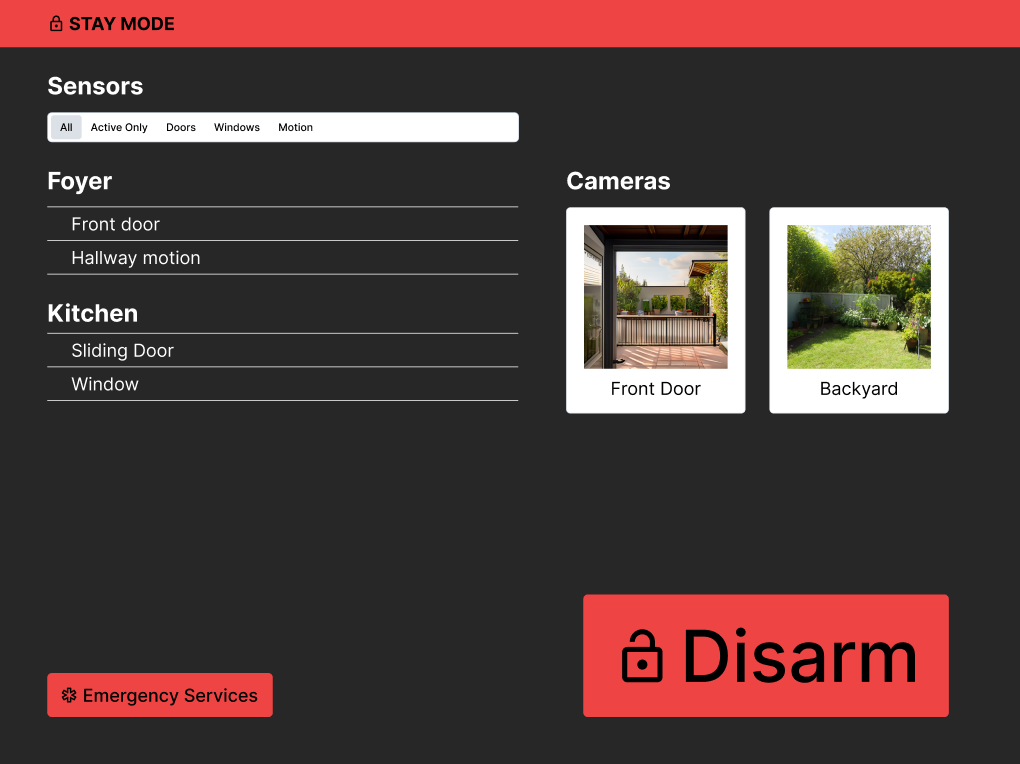
In one of my more unusual assignments, we were tasked with rethinking existing safety-critical systems. In our case, we settled on the common building security system. Research for this involved both a competitive analysis and secondary research.
This is one such example of the most common alarm system on the market:
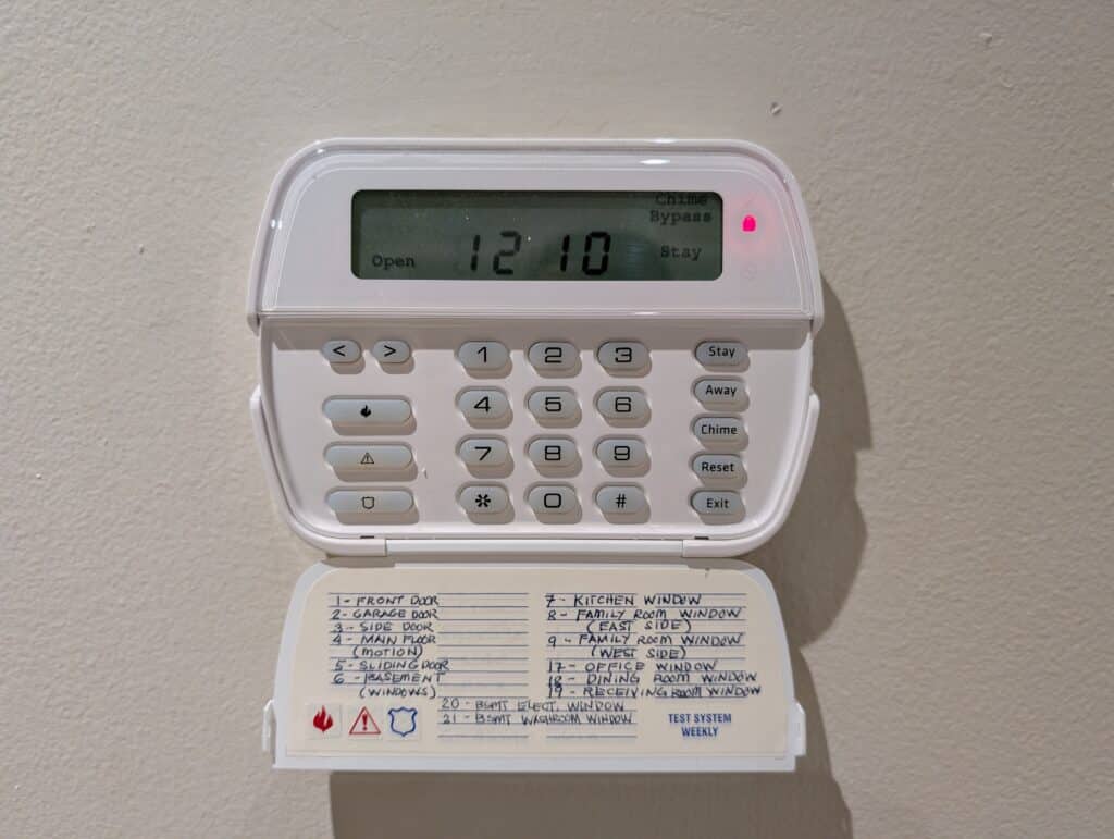
From this system, we immediately identified issues affecting cognition. Mainly that this system, and many like this are all based on needing to recall critical information. For instance:
- These interfaces displayed both status messages and zones in cryptic language, with some of the worse examples using only numbers.
- A number corresponding to a zone that had to be looked up in a table is a major inefficiency, taking time and mental resources away from correcting issues.
- There were necessary signals that were either poorly-communicated or outright missing entirely, such as recalling that an entrant has 60 seconds to disarm a building once they trip a sensor.
Our secondary research, and further market analysis, further justified the need for a redesign of security systems. During our research, we discovered that:
- User error was the leading cause of false alarms, which expends emergency resources
- The security market was fragmented, with completely incompatible devices somehow being made to work together to secure a building
One particular case study we have noted in our research was that of the 2019 Notre Dame fire, in which one of the factors leading up to it was an alarm displaying messages that were not understood by cathedral staff.
These are systems requiring heavy amounts of training and recollection of usage information in order to operate, something we deemed unacceptable for a safety-critical system. Securing a building, in an actual emergency, demands fast decision-making capability. As humans are not particularly able to recall large amounts of information under pressure, the tools must be able to support them throughout their journey.
Redesign
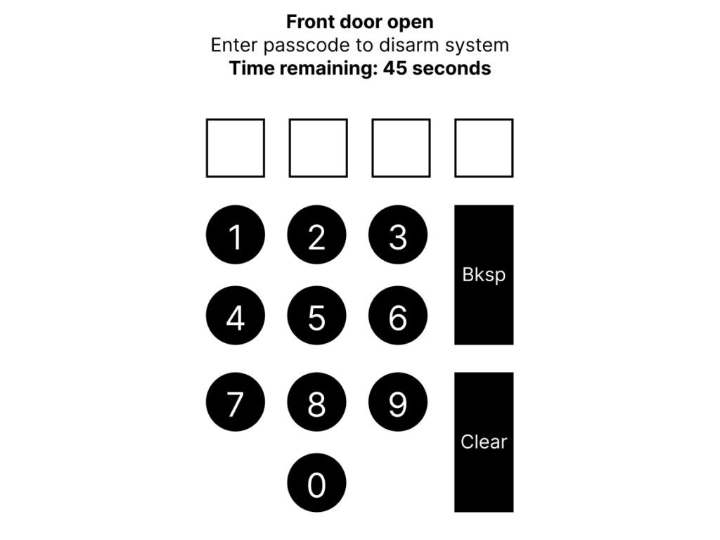
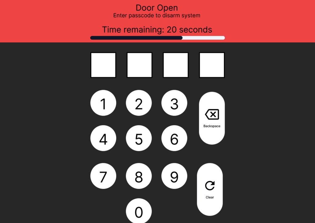
One of the first problems we got to right away was tackling the issue of clear signals and preventing user error. We first decided how to improve on existing signals a security system would give us, as shown below. To note, building areas and their statuses were directly linked together, and arm status went from a red light to text indicating in exactly what mode the system was armed in.
We then re-added missing signals, such as the case with arming and disarming the building. In a typical security system, this was indicated with simple beeps that had no indication of time remaining. We added that back into our system.
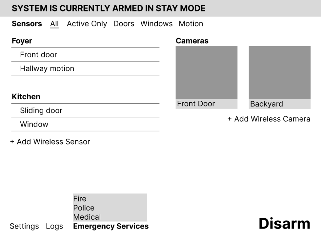
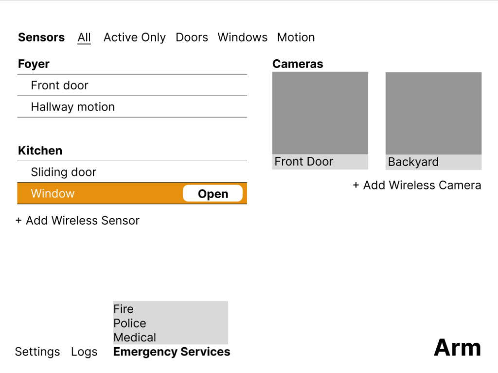
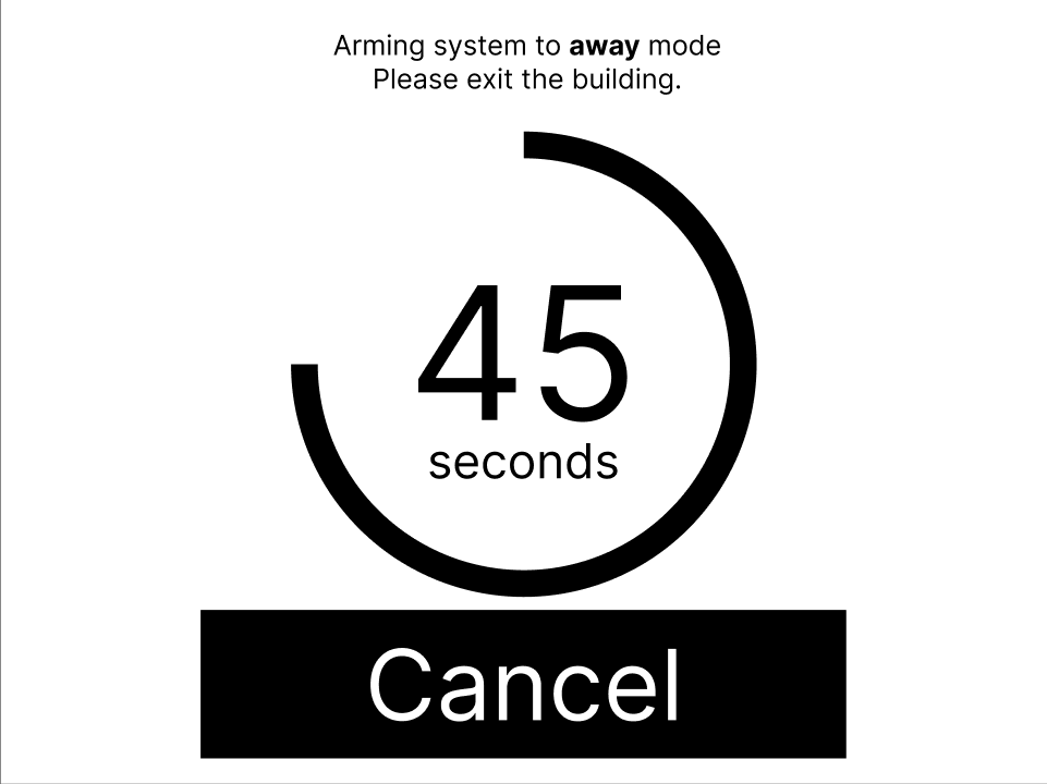
This redesign was created in Figma at a component level, which ensured consistency between screens and flows, and also allowed for rapid iteration based on user feedback. With these components, we were able to construct complex flows that would become the basis of our user tests.
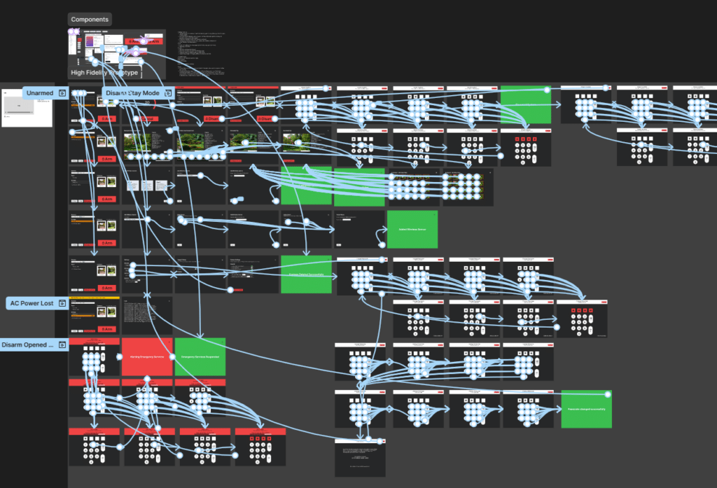
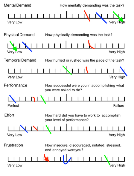
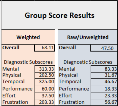
Our test participants were subjected to a series of high-stress tasks and evaluated under the NASA Task Load Index scale, a scientifically-validated system commonly used in human factors research. Initial results were unexpectedly high, particularly with time-limited tasks, indicating to us that there was some stimuli that users had trouble navigating through under pressure.
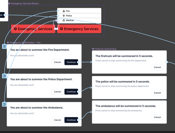
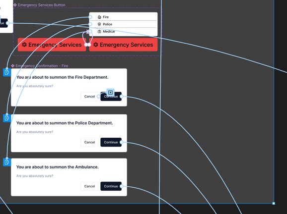
In one instance, users would “dispatch” emergency services, but would accidentally cancel said dispatch since that was the only button on the screen.
Another instance which we caught in the early stages of prototyping was an issue with information overload with the disarm task, as all the information was displayed purely in text. This is something we rectified by having a countdown meter for redundancy, and by having clear separation between the different stimuli.